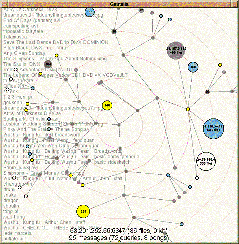
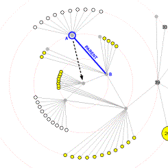
Figure
1: Visualization of the Gnutella network.
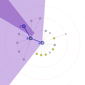
Figure 2. Illustration of the radial
layout technique for two different graphs.
Animated Exploration of Dynamic Graphs with Radial Layout
Ka-Ping Yee
ping@lfw.org
Danyel Fisher
danyelf@cs.berkeley.edu
Rachna Dhamija
rachna@sims.berkeley.edu
Marti Hearst
hearst@sims.berkeley.edu
University of California, Berkeley
Abstract
We describe a new animation technique for supporting interactive exploration of a graph. We use the well-known radial tree layout method, in which the view is determined by the selection of a focus node. Our main contribution is a method for animating the transition to a new layout when a new focus node is selected. In order to keep the transition easy to follow, the animation linearly interpolates the polar coordinates of the nodes, while enforcing ordering and orientation constraints. We apply this technique to visualizations of social networks and of the Gnutella file-sharing network, and discuss the results from our informal usability tests.
Understanding network structure is a long-standing problem in information visualization. Application areas such as social network theory and communication network topology are concerned with understanding a node’s degree of connectivity and network distance from other nodes. Visualizations for such applications should provide a representation of “nearness” that users can easily comprehend, and should respond well to graph structures that change over time.
One approach to graph visualization is to use 3D representations or distortion techniques to fit a large number of nodes in a single view. However, most of these approaches, such as the Cone Tree [18] and the Hyperbolic Browser [13] require a tree structure with fixed parent-child relationships. The H3 system [16] can visualize general graph structure, but it temporarily hides the non-tree cross-links in order to do so. Dynamic layout techniques have been developed for systems that incrementally display graphs or support interactive editing [1, 15, 17], though they generally expect an entire graph to be laid out and displayed at once.
An alternative to trying to fit an entire graph into one view is to provide interactive exploration of subregions of the graph. Even if a graph is small enough to display all at once, it can be difficult to understand all of its relationships from only a single view. The ability to interactively view a graph from different perspectives can yield new insights.
In this paper, we use a visualization paradigm in which the view of a graph is determined by the selection of a single node as the center of interest, or focus. The main contribution of this work is a new technique for animating the transitions from one view to the next in a smooth, appealing manner. The algorithm augments the well-known radial layout method [7, 8, 12] by linearly interpolating the polar coordinates of the nodes and enforcing constraints on the new layout to keep it as similar as possible to the previous layout.
When combined with a method for aggregating or
eliding nodes far away from the focus, our technique can also provide an
effective way to explore very large graphs.
Figure 1 shows our implementation in action, applied to visualization of
the Gnutella network [11].
We assume that we are given a graph that consists of one connected component. The graph may dynamically change over time with the insertion or deletion of nodes. We refer to any two nodes joined by an edge in the graph as “neighbors.” In this visualization approach, the viewer can navigate the graph by selecting any visible node to become the focus node. The graph is then rearranged to reflect network distances from the newly chosen focus.
In this
paper, we use a visualization paradigm in which the view of the graph is
determined by the selection of a single node as the center of interest, or
focus. The main contribution of this
work is a new technique for animating the transitions from one view to the
next, in a smooth, appealing manner that minimizes confusion. The algorithm
builds on the well-known radial layout method [7, 8, 12]. The algorithm enforces constraints on the
new layout to keep it as similar as possible to the current layout, so that the
transitions are easy to follow. When
combined with a method for aggregating or eliding nodes far away from the
focus, our technique can also provide an effective way to explore very large
graphs. Figure 1 shows our
implementation in action, applied to visualization of the Gnutella network [11].
For the purpose of layout, we treat the graph as a tree rooted at the focus node. We determine the parent-child relationships in the tree by performing a breadth-first traversal of the graph starting from the focus. Every node except the focus will have one neighbor as its parent, possibly some other neighbors as its children, and possibly other “non-tree” neighbors that are neither.
Figure
1: Visualization of the Gnutella network.
Figure 2. Illustration of the radial
layout technique for two different graphs.
After layout, lines are drawn to show all the edges in the graph, with non-tree edges drawn in a different color than edges in the tree.
2.1.1. Radial Layout. Since the focus of attention is a single node, it is natural to place this focus node at the center of the display and lay out the other nodes around it. A straightforward method for laying out the other nodes, called “radial drawing” in [7], is used here. Nodes are arranged on concentric rings around the focus node. Each node lies on the ring corresponding to its shortest network distance from the focus. Immediate neighbors of the focus lie on the smallest inner ring, their neighbors lie on the second smallest ring, and so on. Our implementation draws these rings explicitly to make the network distance apparent.
The angular position of a node on its ring is determined by the sector of the ring allocated to it. Each node is allocated a sector within the sector assigned to its parent, with size proportional to the angular width of that node’s subtree. A method similar to this is described in some detail as “radial placement” in [22], where all the nodes are the same size, and so the angular width of a node’s subtree is simply the number of leaf nodes among its descendants.
2.1.2. Space Allocation. Our algorithm allows nodes to be drawn with varying sizes. To minimize the possibility of larger nodes occluding smaller ones, we take the size of each node into account when allocating space on the rings. The angular width of each individual node is its diameter divided by its distance from the focus. We can compute this for every node since we know the network distance from each node to the focus. We find the width of any subtree by computing the angular width of its top node, the total angular width of its child subtrees, and choosing the larger of these two quantities. Each node is placed at the center of the angular sector allocated to it.
Figure 2 illustrates this layout method for two example graphs. In both cases, node A is the focus, and it is allocated all 360 degrees to distribute among its children. Node B has many children of its own, and so it is given more angular space than its siblings are. The region assigned to node B’s subtree is lightly shaded. Node B’s children lie on the second ring; node C, one of these children, is assigned the slice of the second ring shown in darker shading. All of node C’s descendants are then arranged within that shaded region.
Our algorithm comfortably accommodates the addition and deletion of nodes. Radial layout is a reasonable choice for dynamically changing graphs since the addition or deletion of a node perturbs its siblings only a small amount, especially as the graph becomes dense.
To explore the graph, a user selects a visible node to become the new focus. The new layout tree is found by performing a breadth-first search from the new focus, thereby computing the network distance from the new focus to each node. The edges between nodes are reinterpreted as a new set of parent-child relationships. The new layout is determined by assigning each node to the appropriate ring and allocating angular sectors of rings as discussed above.
While this is sufficient to show the graph from the perspective of the new focus, simply switching to this new view can cause a highly disorienting rearrangement. To reduce this disorientation, we use animation to perform a smooth transition, and also enforce some constraints on the new layout to keep it similar to the current layout so that the transition will be easier to follow.
Animation has been used effectively in other work to help maintain orientation in data visualizations and in user interfaces. The Cone Tree and Perspective Wall in the Information Visualizer [2, 14, 18] use 3-D animation to aid the user in tracking objects. Eades and Huang use animation in force-directed graphs to smooth transitions as the user changes focus [9].
Some other interactive graph browsers also preserve invariants to help keep the user oriented. For example, in H3, when a node is selected, an animated transition moves it to the center of a sphere. The transition includes a rotational component so that when the node reaches the center its ancestors are on its left while its descendants appear on the right [16].
The Hyperbolic browser [13] places nodes and links within a hyperbolic space; changing the focus node in effect changes which portion of the space is currently centered. By contrast, in our system changing the focus nodes usually changes the layout of the nodes relative to one another. This is not necessary in the hyperbolic browser as it is applied to tree structures only, whereas our method is designed to display graphs with their associated crossing lines.
2.2.1. Transition Paths. The simplest transition between layouts would move each node along the straight-line path from its old position to its new position. Such linear interpolation, however, can yield confusing animation. In most transitions, many nodes stay on the same ring or move to an adjacent ring, yet straight-line movement could cause a node to leave its ring and travel far away from it before returning. Straight-line movement would also cause many nodes to crowd into an unreadable clump in the center of the display and then separate as they approach their final positions.
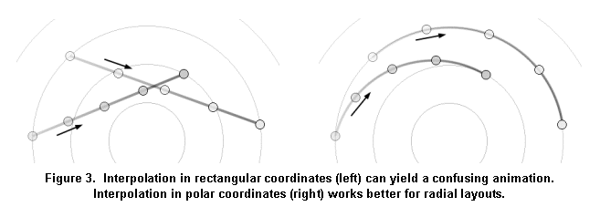 Since the nodes are radially positioned, it
makes more sense to linearly interpolate the polar coordinates of the nodes, rather than their rectangular
coordinates. Thus, a node that stays on
the a ring follows the circumference of the ring, while a node that changes
rings smoothly spirals from one ring to another. When sibling subtrees maintain their ordering, this also
preserves the boundary between the regions allocated to sibling subtrees
throughout the transition, so that nodes moving in toward the center do not
collide with other nodes that are on their way out.
Since the nodes are radially positioned, it
makes more sense to linearly interpolate the polar coordinates of the nodes, rather than their rectangular
coordinates. Thus, a node that stays on
the a ring follows the circumference of the ring, while a node that changes
rings smoothly spirals from one ring to another. When sibling subtrees maintain their ordering, this also
preserves the boundary between the regions allocated to sibling subtrees
throughout the transition, so that nodes moving in toward the center do not
collide with other nodes that are on their way out.
The radial layout algorithm
generates an implicit expectation that radial distance should convey network
distance from the focus at all times; interpolating in polar coordinate space
is consistent with this expectation. The
result is a much smoother animation in which groups of nodes rotate about the
center of graph together. The
clustering of nodes in this way dramatically reduces the cognitive effort to
understand the animation, since it permits the human visual system to chunk
constituent objects into a unit. It
also causes nodes to move in arcs rather than straight lines, borrowing an
effective technique from traditional animation [3].
2.2.2. Transition Constraints. We devise two constraints to maintain the best possible consistency between the old and new layouts.
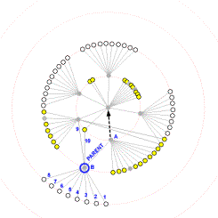
First, we choose an orientation for the new layout that reduces rotational travel. Consider the current parent of the selected new focus. This parent must end up on the first ring since it is an immediate neighbor of the new focus. We orient the new layout so that the direction of the edge joining the new focus and its parent remains constant. Figure 4 shows an example where node A is selected to become the new focus. Node A’s current parent is node B; the new layout is oriented so that the edge AB maintains the same direction.
Second, because the graph is not necessarily a tree, some of a node’s new children might currently be its non-tree neighbors. This could cause edges to cross over as nodes change roles from being a neighbor to being a direct child. To avoid this problem, we examine the directions of each of the edges to the node’s neighbors in the current layout, starting from the edge joining the node to its new parent and proceeding clockwise. We then maintain this ordering of children in the new layout.
This ensures that the tree edges in the new layout will not coincide with each other during the transition. In Figure 5, node A, currently residing on ring 1, is selected to become the new focus. Consider what happens to node B, a child of node A, during this transition. Before the transition, edges 1 through 8 are edges to node B's children, and edges 9 and 10 are non-tree edges. During the transition, node B heads for ring 1 while its neighbors (except for node A) all head for ring 2. Notice how edges 1 through 10 maintain their relative order. This ensures that the tree edges in the new layout will not coincide with each other during the transition.
2.2.3. Animation Timing. Finally, we want to provide the best possible visual constancy at the beginning and the end of the animation. Applying another technique of traditional animation to interaction [3], we use slow-in, slow-out timing rather than straight linear timing. As Figure 6 shows, this was implemented by using a segment of the arctangent function to govern the animation's progress over time. The animation begins slowly, smoothly accelerates, and then decelerates at the end. Most of the movement occurs in the middle third of the time interval. This provides good visual cues to help the user anticipate the movement of nodes into their new positions.
2.2.4. Scalability. This technique seems to work well for several hundred nodes. For larger graphs, it can be disorienting to jump directly from a central node to a peripheral one. In such a case, it may be better to perform a series of transitions to intermediate focus nodes along the path in the graph from the old focus node to the new focus node. The technique could also be made to scale better by judiciously aggregating or hiding peripheral nodes in the display.
![]()
 animates to
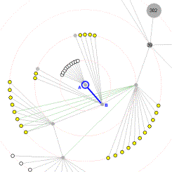
Figure 4. Node A is selected to become the new focus. The orientation of edge AB is maintained.
![]()
 animates to
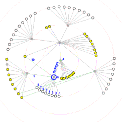
Figure 5. Node A becomes the new focus. The ordering of node B’s neighbors is preserved.
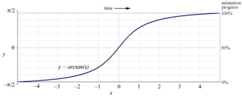
Figure 6. Slow-in, slow-out animation
timing
We implemented the above techniques in a prototype visualization tool, which we applied to two different types of datasets.[1] The first is a real-time visualization of a local part of the Gnutella file-sharing network consisting of a dynamic data set of about two hundred nodes. The second is a visualization of social network ties between families consisting of a static data set of 16 nodes.
Implementation was done in Python [19] using Tkinter as the user interface toolkit. Python is an excellent prototyping tool and it proved to be highly portable: our program ran correctly on multiple platforms without a single change even though it involved threading, networking, and graphical user interface code.
We first applied these layout and animation techniques to visualizing and exploring the Gnutella [4, 11] network. This network has previously been visualized as a static layout [5, 20]. Graph nodes represent hosts in order to display the topology of the virtual network; the nodes and connections are colored in order to show their status and behavior. Each host is drawn as a circle with area proportional to the number of files available. Nodes appear in the graph as hosts are discovered, brighten as connections are established, and darken as connections are dropped. Query keywords received from a particular host are displayed above its circle.
At a glance, users can see how many nodes in their immediate network are up and responding. Watching the visualization for a few moments gives the user a good sense of which nodes are likely to relay queries and which remain silent, which provide many files and which have few. The concentric rings displayed in the background help the user to determine distance from the focus by the shortest known path. The rings also help to make the focus node visually obvious.
Users can click on an individual node to obtain more detailed information (such as its IP address and port number, the number of files offered, the total number of kilobytes of data offered, and a count of the types of messages we have seen from the node). Refocusing on a node helps to illustrate how that node is connected to the other nodes that have been discovered thus far.
The visualization tool also allows users to track searches through the network. In Gnutella, search queries can get forwarded to many hosts, but the messages do not identify the originator of the query. When we see a query message arrive from a particular node, we do not know if this node actually originated the query or is simply passing it along to us. To see how a particular request propagates through the network, the user can insert a test query containing a special identifying string by clicking on a node. The selected node will turn red, and other nodes turn red when they are observed to forward the same request.
Our visualization quickly made many things apparent about the network. We learned that the network was filled with impatient nodes, constantly connecting and disconnecting. There were very few large nodes displayed; most hosts were not sharing any files. We saw that searches were propagated unevenly, at best: some nodes would quickly relay our searches to the rest of the network, while others would simply drop the search. Often a test query would not reappear for quite a while, followed by a long series of echoes every few seconds. We also observed that most user search queries are very simple and general, consisting of one or two terms.
Visualization techniques have been used extensively for understanding social networks [10]. In this domain, radial trees are known as “target sociograms” and are used for examining social networks from a single actor's perspective. We believe that interactive exploration of social networks using the techniques we have discussed can make such diagrams even more useful.
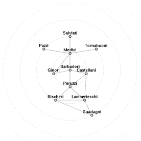
As an example, we used Padgett’s “Florentine families” data set from Wasserman and Faust [21], which represents marital and business ties between powerful banking families in Renaissance Italy. Here our technique is able to produce perspectives on the network from two different foci (in this case the Barbadori and Medici families), with smooth transitions between the views. The placement of the nodes on rings makes it easy to see at a glance which families are closely connected to the focus. In addition, the different views help make apparent certain features of the social network. For example, it is clear that the Barbadori family is a unique bridge for business between the Medicis and the Peruzzis, and that the Medici family is closely tied to many other families through both business and marital links.
When we demonstrated the Gnutellavision system, informal user interviews revealed a great deal of enthusiasm for the tool. Users were interested in the content of the search queries, appreciated the ability to refocus the layout, and found the use of node size to represent the number of files to be intuitive. Users were generally very curious about the others on the network
![]()
 animates to
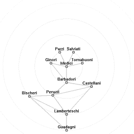
Figure 7. Business relations between families. The focus moves from Barbadori (left) to Medici (right).
![]()
 animates to
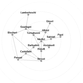
Figure 8. Marital ties between families. The focus is changed from Barbadori (left) to Medici (right).
once they had a visual representation. The visualization seemed to offer a greater sense of “connectedness” to others who participate in the network and provided a qualitatively different experience compared to existing interfaces for interacting with the network. Almost all of the users asked if we planned to incorporate the visualization into a full-fledged Gnutella client. Further details about Gnutellavision can be found in [6].
We also questioned ten users specifically about the effectiveness of our animation techniques as applied to both the social network visualization, using the smaller graph of 16 nodes, and the Gnutella visualization, using a larger dynamically generated graph of approximately two hundred nodes.
First, we asked users to explore visualizations with slow-in, slow-out timing and without, and to specify a preference. Eight users preferred the slow-in, slow-out timing, stating for example that it was more “pleasing” or “more fun to use.” When asked to evaluate interpolation in polar vs. rectangular coordinates, seven users chose rectangular coordinates for the smaller graph, but eight chose polar coordinates for the larger graph. For the smaller graph, many users expected the nodes to move in straight lines and were surprised when they did not. For the large graph, however, most users preferred transitions using polar coordinates, because they preferred that the nodes “swing around the center,” instead of “all clumping into a mess in the middle and then moving away.” When evaluating ordering constraints, users expressed no preference either way for the small graph, but six users expressed a preference for ordering constraints in the larger graph.
Next, we asked users to choose between using a visualization with all three techniques (slow-in slow-out timing, polar interpolation, and ordering constraints) present or absent. In the small graph, five chose the version with all features present and five chose the version with features absent. When asked about the larger graph, however, nine preferred the version with all of the techniques present.
These results indicate that our animation techniques do help to reduce confusion and to improve user experience while exploring a graph, and that the benefits become more significant as the size of the graph increases (presumably because a small graph can be viewed in its entirety independent of the animation techniques).
We have designed, implemented, and tested techniques for interactively exploring graphs in a focus-plus-context style. We presented a new method for animating the transitions from one view to the next in an appealing manner that reduces confusion. We combined the techniques of interpolation in polar coordinate space, slow-in, slow-out motion timing, and the enforcement of constraints on the layout to produce transitions that are smooth and easy to follow.
We successfully applied these techniques to visualizations of social networks and the Gnutella file-sharing network. Informal user testing supports our hypotheses that animation, the use of polar coordinates for interpolation, the ordering constraints on nodes, and the slow-in, slow-out timing all improve the ability to maintain context while exploring the graph. A natural extension of this work is to combine this technique with methods for aggregating or eliding nodes [22] to allow exploration of very large graphs.
We would like to thank the participants in our usability study, who provided valuable feedback at various stages during the design.
[1] Brandes, U., Kääb, V., Löh, A., Wagner, D., and Willhalm, T.,
“Dynamic WWW Structures in 3D,” Journal
of Graph Algorithms and Applications, vol. 4, no. 3, pp. 183-191, 2000.
[2] Card, S. K., Robertson, G. G., and Mackinlay,
J. D., “The Information Visualizer, an information workspace,” Proceedings of CHI ’91, 1991.
[3] Chang, B.-W. and Ungar, D., “Animation: From
Cartoons to the User Interface,” Proceedings
of UIST ’93, Atlanta, GA, 1993.
[4] Clip2 DSS, “Gnutella Protocol Specification
v0.4,” http://www.clip2.com/GnutellaProtocol04.pdf
[5] Clip2 DSS, “Partial Map of Gnutella Network,
7/27/00,” http://www.clip2.com/dss_map.html
[6] Dhamija, R., Fisher, D., and Yee, K.-P.,
“Gnutellavision: Real-Time Visualization of a Peer-to-Peer Network”, 2000, http://bailando.sims.berkeley.edu/infovis/gtv/
[7] Di Battista, G., Eades, P., Tamassia, R., and
Tollis, I. G., Graph Drawing: Algorithms
for the Visualization of Graphs.
Upper Saddle River, N. J: Prentice Hall, 1999.
[8] Eades, P., “Drawing Free Trees,” Bulletin of the Institute of Combinatorics
and its Applications, pp. 10-36, 1992.
[9] Eades, P. and Huang, M. L., “Navigating
Clustered Graphs using Force-Directed Methods,” Journal of Graph Algorithms and Applications, vol. 4, no. 3, pp.
157-181, 2000.
[10] Freeman, L., “Visualizing Social Networks,” Journal of Social Structure, Carnegie Mellon
University, vol. 1, no. 1, 2000.
[11] Gnutella, http://gnutella.wego.com/
[12] Herman, I., Melançon, G., and Marshall, M. S.,
“Graph Visualisation and Navigation in Information Visualisation,” Proceedings of Eurographics ’99,
Aire-la-Ville, 1999.
[13] Lamping, J. and Rao, R., “The Hyperbolic
Browser: A Focus + Context Technique for Visualizing Large Hierarchies,” Journal of Visual Languages and Computing,
vol. 7, no. 1, pp. 33-55.
[14] Mackinlay, J. D., Robertson, G. G., and Card,
S. K., “The Perspective Wall: Detail and context smoothly integrated,” Proceedings of CHI ’91, 1991.
[15] Moen, S. ,
"Drawing Dynamic Trees," IEEE
Software 7(4):21-28, July 1990.
[16] Munzner, T., “H3: Laying Out Large Directed
Graphs in 3D Hyperbolic Space,”
Proceedings of Information Visualization ’97, 1997.
[17] North, S. C., “Incremental Layout in DynaDAG,” Proceedings of Graph Drawing ’95, 1996.
[18] Robertson, G. G., Mackinlay, J. D., and Card,
S. K., “Cone Trees: Animated 3D visualizations of hierarchical information,” Proceedings of CHI ’91, 1991.
[19] Van Rossum, G., Python programming language, http://www.python.org/
[20] Steinberg, S. G., Map of the Gnutella network, http://www.geog.ucl.ac.uk/casa/martin/atlas/more_topology.html
[21] Wasserman, S. and Faust, K., Social network analysis: methods and
applications, Cambridge University Press, 1994.
[22] Wills, G. J., “NicheWorks—interactive visualization
of very large graphs,” Proceedings of
Graph Drawing ’97, 1997.
[1] A movie explaining the animation technique can be found at http://bailando.sims.berkeley.edu/infovis.html