| |||||||||||||||||
Designing a search system and interface may best be served (and executed) by scrutinizing usability studies. |
|
|
What constitutes a good user interface for search? It depends on the type of answers that users are pursuing. It can be helpful to think of these types of answers as lying along a conceptual continuum, ranging from directed search to informal browsing to text mining and analysis. For example, consider the following questions a user might ask of a large text collection or the Web: 1. How tall is the average female giraffe? 2. What are some good design ideas for landscaping my client's yard? 3. What are some promising untried treatments for Raynaud's disease? The kinds of answers that best respond to these questions differ qualitatively. For the giraffe question, a single short phrase can be an acceptable response (for example, "4.4 meters") and a standard search interface probably suffices; the user should be able to enter a list of keywords ("giraffe female height") or a natural language question ("What is the height of the average female giraffe?") and the system should simply list the answers, along with links to additional information. For questions of this flavor, Web search engines (such as Google) and automated question answering systems are becoming increasingly successful. This is due in part to a recent swell in commercial and research efforts in this direction, and in part to the redundancy of information available on the Web, which makes systems like these likely to find good answers. For the landscaping question, a simple list of results is not the best response. It is a more open-ended task; designers tend to look through images searching for inspiration from designs done by others. Thus an interface for this task should allow a designer to browse through a collection and view images relevant to the climate, shape, and existing foliage of the client's yard. The system should also allow a fluid shift from one idea to other related ideas. For example, a view of a garden containing a small cactus in the corner might inspire a designer to change direction and start looking at desert landscapes. This kind of shift should be supported in a manner that does not interrupt the chain of thought, enabling the designer to smoothly steer from one direction to the next, without getting lost and without getting stuck. A direct search method should be a part of such an interface, but it should be tightly integrated with browsing support so as not to interrupt the flow of exploration. An interface framework that supports this type of task is described here. The question regarding new treatments for Raynaud's represents an analysis problem on the far end of the search task continuum. Trying to discover potential causes of rare diseases by finding links across the biomedical literature is best termed a "text mining" or "knowledge discovery" task [4]. Although it has both a search and a browsing component, this task also requires the ability to track trails of reasoning, perform comparisons, summarize, and otherwise process the information in detail. Designing an interface to support such a task is a fascinating problem, but text mining interfaces are in their infancy. In this article we focus on the middle part of the answer type spectrum by posing the question of how to design a search system and interface that provide a "browsing the shelves" sensation for large collections of information items. We first summarize what is known from usability results about how to design good search user interfaces. We then illustrate these principles with a browse-and-search interface framework we have developed that has been successful in preliminary usability studies.
|
|
|
Search Interface Desiderata How does one build an interface that successfully supports both direct search and browsing? The press is rife with accounts of failed searches and unhappy users. For example, a recent report by Forrester Research found that while 76% of firms rated search as "extremely important" only 24% consider their Web site's search to be "extremely useful" [6]. In our view, the way to do things correctly is to use the evidence found in the results of usability studies of search systems. Unfortunately, most studies of search behavior are inconclusive about how to improve the system (for example, [12]), but some consistencies do emerge about what works. Here, we summarize which search features tend to work well, and which fail, in practice. Throughout this article, the assumption is that the user population consists of people who do not specialize in search and who have only basic knowledge of how to use computers. First and foremost, most users engaged in directed searches are not interested in search for its own sake; thus systems that make users focus on the operations for performing search are seldom successful [1]. For browsing tasks, users are engaged with the data, but again are not focused on the mechanisms of the search system. Users can tell the difference between these two cases. In a small study we conducted on a recipe Web site [3], we found that users preferred a browsing-oriented interface for a browsing task, and a direct search interface when they knew precisely what they wanted. Features found to work well across studies are color highlighting of search terms in result listings (also known as "keywords-in-context"); sorting of search results along criteria such as date and author; and grouping search results according to wellorganized category labels [5]. Certain features are helpful in principle, but only work in practice if the underlying algorithms are highly accurate and if the interface is carefully designed. Some examples of such features include spelling correction, automated term expansion, and simple relevance feedback (also known as "more like this"), in which the user selects one item and the system shows items that are similar in scope along several dimensions. Two simple features are underappreciated by search researchers—exposing metadata in the interface, and making use of hyperlinks and the interactive nature of user interfaces. Other reports have found that hyperlinks outperform search on most Web sites [6]. Our view is the two should be tightly integrated for access to content within Web sites or large information collections. Specific problems most often named in the literature include empty result sets (zero results); disorganized result lists; results that make the user feel lost or overwhelmed; difficulty with using the correct terminology; and difficulty with forming queries where special syntax is required (for example, specifying Boolean expressions) [5]. The incorporation of visualization into search interfaces has yet to be favorably received by users in general [11]. Similarly, text clustering is not found to be valuable for ordinary users who prefer organization according to categories that have predictable, understandable meanings [9]. These tools are more likely to be effective for knowledge discovery tasks, like the Raynaud's treatment question. Shneiderman et al. [10] specify eight design desiderata for search user interfaces: strive for consistency; offer informative feedback; offer simple error handling; permit easy reversal of actions; support user control; reduce short-term memory load; design for closure; and provide shortcuts for experts. The browsing interface described here attempts to incorporate most of these design elements. |
|
|
Search Interfaces That Flow We have created a search interface framework called "Flamenco" whose primary design goal is to allow users to move through large information spaces in a flexible manner without feeling lost (see Figure 1). A key property of the interface is the explicit exposure of hierarchical faceted metadata, both to guide the user toward possible choices, and to organize the results of keyword searches. The interface uses metadata in a manner that allows users to both refine and expand the current query, while maintaining a consistent representation of the collection's structure. This use of metadata is integrated with free-text search, allowing the user to follow links, then add search terms, then follow more links, without interrupting the interaction flow. This system builds on earlier work that shows the importance of query previews [8] for indicating next choices. Query previews allow users to recognize terms rather than remember them, and eliminate the occurrence of empty result sets. Architects and city planners were the target user population for the studies described here. The collection consisted of images from an architecture slide library. However, we have applied the framework to other datasets, including a collection of biomedical articles and a collection of consumer products. We approached the problem of developing the search interface framework by following user-centered design practices from the field of human-computer interaction [2]. We first performed a needs assessment of the target population, including an ethnographic analysis of how architects use and look for images as inspiration for their design work. We then built a simple prototype and evaluated it with an informal usability test. Next, we conducted two rounds of development and two formal usability studies, revising the interface based on the results of each study. By the final round, the study participants were very enthusiastic about the design. Several expressed a strong desire to use the new system in the future, despite the fact it differs significantly from conventional search interfaces. |
|
|
Hierarchical-Faceted Metadata Content-oriented category metadata has become more widespread in the last few years, and there is much activity in the creation of standards for describing content in various fields (for example, Dublin Core and the Semantic Web; dublincore.org; www.w3.org/2001/sw). Web directories such as Yahoo and the Open Directory Project (www.yahoo.com; dmoz.org) are familiar examples of the use of metadata for navigation structures. Web search engines have begun to provide search hits on category labels together with other search results. Many individual collections already have rich metadata assigned to their contents; for example, biomedical journal articles have on average more than a dozen content attributes attached to them. Metadata for organizing content collections can be classified along several dimensions: The metadata may be faceted, that is, composed of orthogonal sets of categories. For example, in the domain of architectural images, some facets are Materials (concrete, brick, wood, among others), Styles (Baroque, Gothic, Ming), Locations, and so on. The metadata may be hierarchical ("located in Berkeley, California, United States") or flat ("by Ansel Adams"). The metadata may be single-valued or multivalued. That is, the data may be constrained so that one value at most can be assigned to an item ("measures 36 cm tall") or it may allow multiple values to be assigned to an item ("uses oil paint, ink, and watercolor").
There are a number of issues associated with the creation of metadata itself that are not addressed in this article. The most pressing problem is how to decide which descriptors are correct or at least the most appropriate for a collection of information. Another problem relates to how to assign metadata descriptors to items that currently do not have metadata assigned. Many researchers are addressing these issues, and the field of automated text categorization is making great strides. Additionally, many important collections with hand-assigned hierarchical metadata already exist. We illustrate the interface using an architectural image database containing about 40,000 photographs of landscapes and buildings from a wide variety of historical periods, styles, and geographic regions (see Figure 1). The images are classified under about 16,000 hierarchical metadata terms, which we manually reorganized into nine facets: people, locations, structure types, materials, periods, styles, view types, concepts, and building names. We use a brief scenario to demonstrate how the interface works. Imagine a user named Claire who has a beach house she plans to renovate, with the goal of bringing more natural light into the living room. Before she meets with the architect, she browses through the architectural image collection to gather a few ideas. She begins at the starting page (see A in Figure 1). This page shows an overview of available topics, each hyperlinked to the equivalent of a query on the corresponding metadata term, and each link showing how many items have been assigned that topic label. To help her in this search, the starting page also includes three sample images from each facet. To begin her search, Claire may either click one of these links or issue a keyword search. Claire opts to begin by clicking the hyperlink "interior views" in the View Types facet and has arrived at what we call the "matrix view" (see B). There is a column of metadata on the left and the images in the current result set on the right. The matrix shows query previews for all of the metadata terms assigned to the images in the current result set. These previews are updated as constraints are added or removed. The caption under each image gives the name of the building, the location, and the architect. Claire's eye is drawn to one image showing an interior flooded with daylight. She clicks on this image to see a more detailed view (C). After reading the metadata categories assigned to the image, Claire clicks on the term "windows" found under the Structure Types facet. This refines her query because it conjoins the metadata term "windows" with the current query. Doing this creates a new matrix page (see D). Now the query, consisting of metadata from the two selected facets (View Types and Structure Types), is shown at the top of the screen in the form of hyperlinked history trails (or "breadcrumbs"). The images are grouped according to subcategories of the "windows" metadata category; up to four sample items are shown in each subcategory. Note that the interface allows the user to navigate multiple hierarchies simultaneously. To further refine her search, Claire can select terms from other facets by clicking in the matrix on the left or by selecting a subcategory on the right. The results set can be broadened (expanded) to include more items by selecting a general category within the breadcrumb or by clicking the X to remove a category constraint. Assume that Claire clicks on the "openings" category, just above "windows" in the breadcrumb, to relax the Structure Types constraint. This brings her to E. Clicking on an image within the "skylights" subcategory brings her to the image detail (F) where she sees several other helpful terms: "daylight," "beams," and "beach houses." This page allows Claire to make lateral moves, shifting to associated categories that were not part of the original query. We have found this facility is important for promoting shifts to areas of the collection that users had not considered previously. The interface makes a keyword search facility available at all points in the interface. The scope of the search is by default the current result set, although users can also choose to search through the entire collection. Thus Claire might have begun her exploration by running a keyword search on the word "light." In this case, a list of all matching metadata terms appears above the result set, with search terms highlighted as shown in G. Selecting the metadata term "skylights" in the list converts the keyword constraint into a category constraint as shown in H. This, in turn, could lead her to the image detail in F. In some situations, there are too many subcategories or keyword matches to fit on the page. When this occurs, an alphabetized list is presented on a page of its own so the user can make a selection. The links labeled "more"—visible in the matrix view—can also take the user to listing pages of this type. Returning now to the discussion of usability guidelines for search interfaces, notice this interface supports six out of Shneiderman et al.'s eight design desiderata. It is consistent and it constantly gives feedback on the query state. Reversal of actions is supported by various methods for going back, canceling query terms, and starting over. The system maintains the query state entirely in the URL so the browser's back button and bookmark features work correctly. These browser features help to keep the user in control and also serve as important memory aids. The use of query previews emphasizes recognition over recall, which also reduces short-term memory load, and helps provide an information scent of where to go next. The ever-present search box provides a shortcut for the user who has a specific goal in mind. |
|
|
A Usability Study We conducted a usability study in which 19 architects and city planners (practitioners and students) participated. About half stated they looked for images "all the time;" the other half said they searched for images on a monthly or yearly basis. Data was recorded with multiple methods: server logs, behavioral logs (time-stamped observations), online post-task questionnaires, and paper surveys at the end of the session. Two experienced usability analysts conducted each session. A within-subjects design was used in which the interface presented here was compared to a similar one with slightly less functionality, and participants performed several different types of search and browsing tasks. Space restrictions prevent detailed reporting of the results, so only some highlights are presented here; see [3] for more information. Mean ratings for feature usefulness and understanding were high (ranging between 5.6 and 6.9 on a 7-point Likert scale). This was in contrast to previous iterations where participants did not notice, did not understand, or did not like some of the most powerful features. One concern was that with so many varied options participants might find the interface too browsable, and feel lost. However, the results were that participants felt a strong sense of control (average 5.65 on a 7-point Likert scale). A more direct measure of usefulness is how often the features are actually used. Figure 2 summarizes these results, and shows that participants chose to begin more frequently by browsing (12.7% of all operations) than by searching (5%). For refining actions, participants refined by using "Drill in matrix" 26.6% of the time, while the "Search Within" facility was used only 9% of the time. We think this shows the power of the faceted hierarchies, which allow participants to flexibly modify their query rather than forcing them to choose appropriate keywords for searching. The option to expand on a facet is not available in most search interfaces, so this feature was unfamiliar to most participants. Nevertheless, about 7% of the participants' actions were related to expanding a search. We suspect this feature will have heavier use once users become more experienced with the interface. Participants chose to start over in the middle of a task only 0.02% of the time, which suggests they did not get stuck or lost while using the system. The majority (16 out of 19) of the participants said they preferred the power and flexibility of the matrix-based interface to a simpler interface. This is especially significant given it is fairly uncommon for users to prefer more complex and unconventional interfaces. Participants found it easy to refine and expand their searches using the various features; they liked having the choices for refining the search displayed on the left side of the screen along with the images. Participants referred to the metadata display as a "map," an "index," a "table of contents," and a "menu." Some participants were initially put off by the text-heavy appearance of the matrix, but grew to like it after they had completed one or two tasks. Search usability studies show that non-expert searchers have difficulty with Boolean queries beyond simple conjunction. [5]. An advantage of our approach is it allows users to easily compose queries consisting of ANDs of ORs: selecting a category term is effectively an OR of all of its subcategories, and selecting more than one facet produces an AND across facets. Research in the biomedical literature tells us that forming ANDs of ORs of related terms is one of the more effective ways to search [7]. This interface is not without problems. It does appear to have more functionality than is needed for direct search; if users know exactly which item they want, a simpler interface seems to be more efficient. Furthermore, it is hampered by a fundamental problem with the use of metadata: the terminology provided may not match the set of words wanted by users. To address these and other problems, we plan to augment the system in several ways, including incorporating thesaurus term matching into the search, and using techniques from adaptive user interface research. For instance, a relevance feedback mechanism could take into account which metadata facets are most often used together, and could show the most popular facets before less popular ones. |
|
|
Implementation An added advantage of this framework is it can be built using off-the-shelf database technology. (However, special-purpose software may be required in order to scale to millions of items.) The system allows content creators to add new items, and can be applied to entirely new collections without requiring changes to the application logic or the interface. The system is implemented using Python, MySQL, and the WebWare toolkit (www.python.org; www. mysql.com; Webware.sourceforge.net). Collections are stored according to a generic database schema that accommodates a wide range of metadata: facets can be hierarchical or flat, single-valued or multivalued. All components of the interface are dynamically generated, based on the facets and metadata terms defined in the database. A clean abstraction layer translates queries composed of metadata terms into standard SQL queries over the schema. Query previews are generated using the SQL group by operator to count the number of items that fall into each subcategory. The interface design we've described reflects bits and pieces of what can be found in existing Web interfaces, especially on e-commerce sites. Until recently, however, most of these interfaces were confusing and cluttered, or did not allow expansion, or did not successfully integrate search within the navigation metadata. However, some recent commercial systems have begun to incorporate the ideas presented here.1 |
|
|
Conclusion This article has discussed the importance of usability results and user-centered design practices in the development of better user interfaces for different types of search tasks. We have illustrated the results of this approach when applied to an interface that allows for browsing and searching through the use of faceted hierarchies of metadata and hyperlinked query previews, and verified the promise of the approach through usability studies. For more information and a demonstration, see flamenco.berkeley.edu. |
|
|
Authors Marti Hearst (hearst@sims.berkeley.edu) is an associate professor in the School of Information Management and Systems (SIMS) at University of California, Berkeley. Ame Elliott (ame@rii.ricoh.com) is a postdoctoral research scientist at Ricoh Innovations, Inc., Menlo Park, CA. Jennifer English (jenglish@sims.berkeley.edu) is a graduate of the School of Information Management and Systems (SIMS) Masters program at University of California, Berkeley. Rashmi Sinha (sinha@sims.berkeley.edu) is a researcher at the School of Information Management and Systems (SIMS) at University of California, Berkeley. Kirsten Swearingen (kirstens@sims.berkeley.edu) is a graduate of the School of Information Management and Systems (SIMS) masters program at University of California, Berkeley. Ka-Ping Yee (ping@zesty.ca) is a Ph.D. student in computer science at the University of California, Berkeley. |
|
|
|
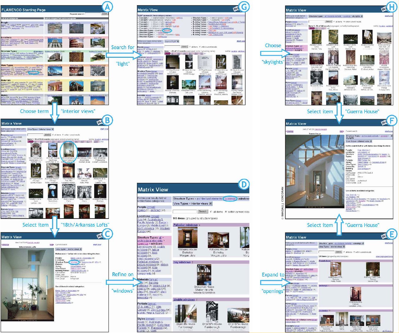 Figure 1. Flamenco: A search interface that flows.
 Figure 2. Percentage of time features were used. "Drill" means
refine by descending a subhierarchy.
Figure 2. Percentage of time features were used. "Drill" means
refine by descending a subhierarchy.|
|
©2002 ACM 0002-0782/02/0900 $5.00 Permission to make digital or hard copies of all or part of this work for personal or classroom use is granted without fee provided that copies are not made or distributed for profit or commercial advantage and that copies bear this notice and the full citation on the first page. To copy otherwise, to republish, to post on servers or to redistribute to lists, requires prior specific permission and/or a fee. |
The Digital Library is published by the Association for Computing Machinery. Copyright © 2002 ACM, Inc. | ||